
North Shore Navigators Team Dashboard
This is the internal Navigators-only dashboard, built for our own staff and players, rather than for scouting purposes. Previously I maintained two separate dashboards, one for hitters and one for pitchers, each with its own filters and data pull, which worked, but was rather suboptimal, so, going into the 2026 season, I updated it all into one app. It reads two season-spanning files (NavsPAs.csv and NavigatorsPitchers.csv), which are maintained on separate branches of my repository and pulled at startup, then sliced by season (2025 and 2026) so that the 2025/2026 toggles in the dashboard operate on one load rather than four separate fetches. The main reason I included 2025 in the dashboard is because of the sheer amount of returners to our roster, which I could work off of for pitch-tagging sakes at the beginning of the season (before communicating with our pitchers on specific arsenal adjustments). Both reads (batter and pitcher CSVs) go through a retry wrapped with backoff and jitter, and are also staggered, as hitting the file host twice back to back on a cold start at the beginning was causing failure and taking the whole app down with it on deploy. Later on this season, I added a password to gate access, as, mentioned on the slide on my NECBL dashboard, one of my analytics interns this year got an offer to play for a team in our league (who we were fighting with for a playoff spot), so I didn't want this data to get out. The password is compared as a SHA-256 hash rather than being stored in plaintext; as with the league dashboard, the interface is only rendered server-side once the correct password is entered, thus meaning that none of it exists in the page for an unauthorized user. All tagged pitch types for our arms are accurate, as after every game, I checked in with pitchers on their usage and potential tinkering of their grips.
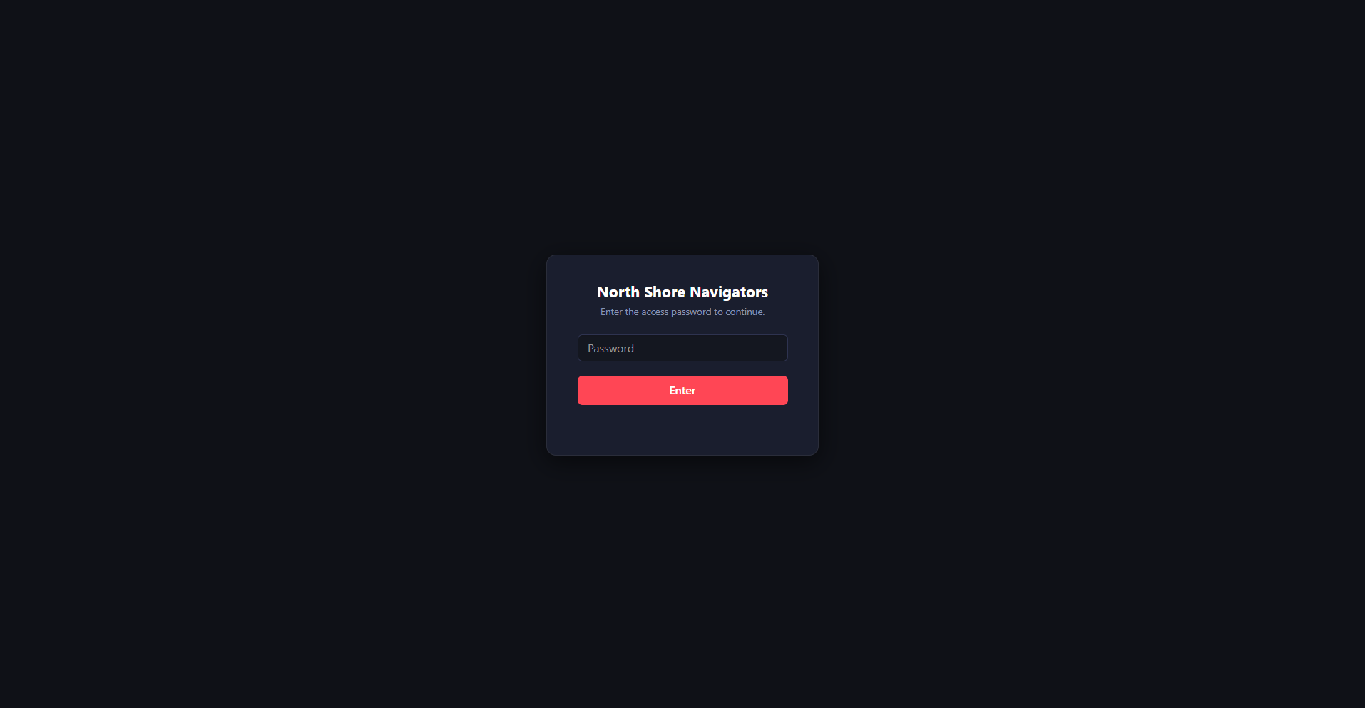
When you click the link, this is what you would see in-season (password removed since the end of the season). The app is on a public shinyapps URL, and beyond that is player-level Trackman data, so the gate went in first rather than last. The password isn't stored in the app (as previously mentioned), but instead is a SHA-256 hash, and after the entry gets compared, the interface is rendered after a correct entry, so that no unauthorized person can look at it.
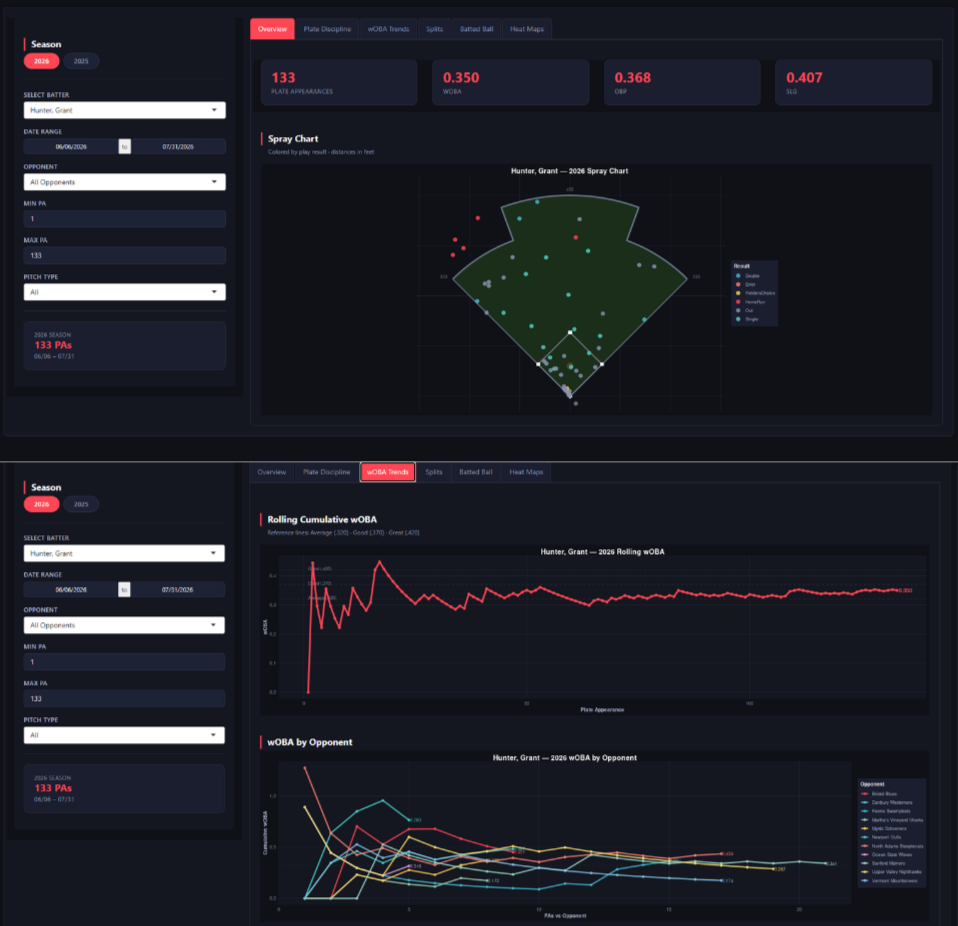
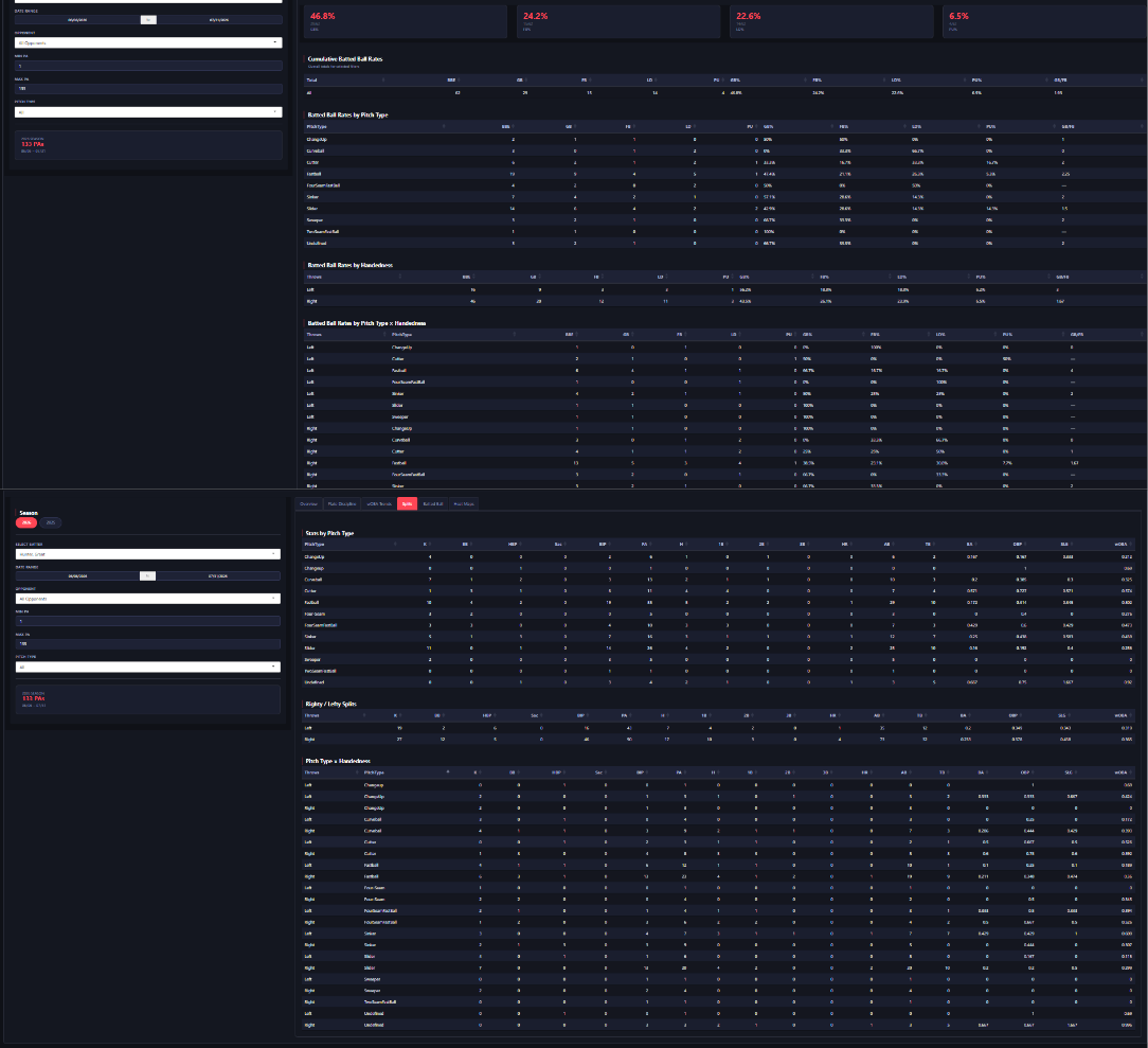
Once the password is entered, the user is shown the hitter's side, which holds six tabs: an overview tab (spray chart and basic numbers), a plate discipline tab (swing decisions in a strike zone), a splits tab (L/R and by pitch type), Batted ball, and heat maps. All six run off the same sidebar, so a filter set once in there holds as you move across the tabs. These filters include season, batter, date range, opponent, the minimum/maximum plate appearance, and pitch type, with a card at the bottom reporting what the filter actually resolves to. In this case, I used Grant Hunter, one of the batters on the Navigators, and you can see, on the top tab that he had 133 plate appearances between June 6 and July 31. The total sample is always visible. As mentioned, the overview tab is rather simple, with plate appearances, wOBA, OBP, and SLG across the top, then a spray chart underneath colored by play result. The wOBA trends tab plots rolling cumulative wOBA against the total plate appearance number rather than date, with reference lines at .320, .370, and .420. The second chart splits that by opponent, with each line accumulating over the plate appearances against the team. The batted ball and splits are table-based tabs, cut by pitch type, pitcher handedness, and by the two crossed (I.E., Sinker from LHP, Sinker from RHP). Batted ball handles contact quality. As you can see, Hunter has 62 batted ball events, with a 46.8% ground ball rate, anda 1.93 GB/FB ratio, with every rate showing the raw count it came from instead of just the rate on its own. The splits tab does the same for outcomes and the crossed table, in my opinion, is quite useful, as it can pinpoint precise pitches that hitters struggle against from a specific handedness, instead of just the dexterity or pitch type. Every column is sortable.
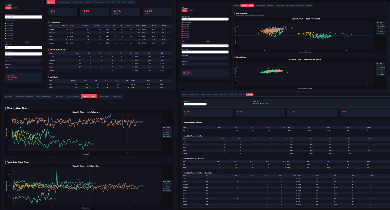
The pitcher tab runs off eight separate tabs off a sidebar built differently than the hitter side of the dashboard, as, instead of a date range, I have each individual outing as a checkbox, so you can look at any selection of games, and within that is a minimum and maximum pitch count cut, so you can examine how well the pitcher holds velo or if the shapes deteriorate over the course of an outing. For the pitching tabs, I used Gian Gamelli, an LHP out of Notre Dame who started the All-Star Game for the North Division and was the Navigators' most productive arm this year. The summary tab is the main scouting card, showing he's got 505 pitches across 7 outings at a 33.1% CSW%, a 52.1% whiff rate, and a 46.1% zone rate, along with an arsenal table containing pitch count, usage, and shape for every pitch he throws. This is all reliant on each individual pitch being labeled correctly, which is why every tagged pitch type for our arms is accurate: after every outing, I check in with each arm on what they actually threw and on any tinkering with grips and correct the tags against what they told me. As this tool is mainly for their usage, I make sure that, even if two different pitch types mesh together, they are labeled separately so that they know what their grip is doing. As you can see on the movement plot, there is a wide range of movement on Gamelli's sweeper, and, if up to my own judgment, I may have marked these as separate shapes (as some have 15 inches of sweep and some have 3), but, Gamelli told me that it was the same grip and same pitch thrown with the same intent, just with some outing-to-outing inconsistencies, and I want them to know how the grip worked to a tee, rather than separating them into their true shape profile which I would do for the opposition. You can also see lefty/righty splits underneath the table. Then, the next tab is the aforementioned Movement and Release tab, which plots every pitch in a break space, along with their release points. Then, the Velocity and Spin tab tracks both against pitch type and range, and the Batted Ball tab gives the breakdown on every pitch type, batter side, and outing.
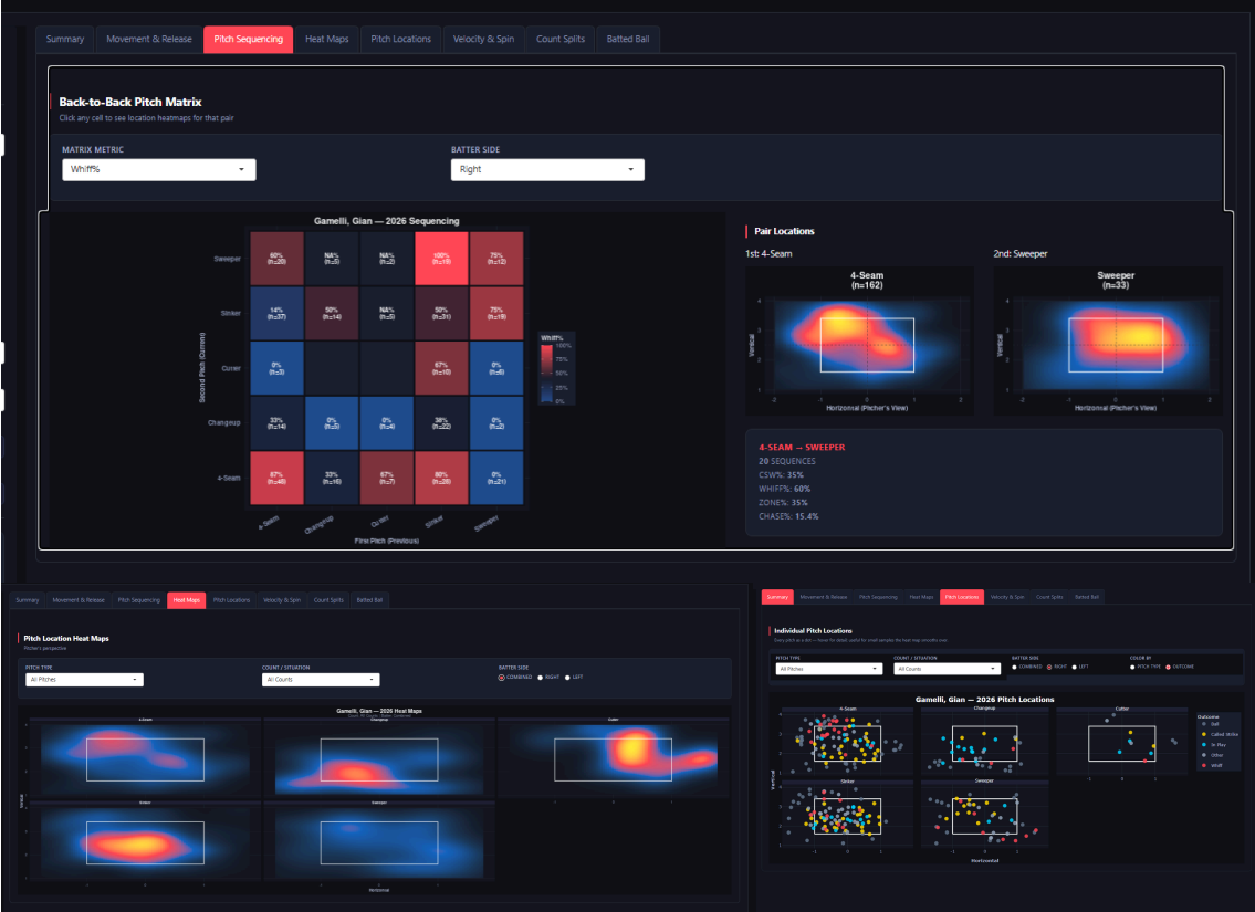
The other three remaining tabs give reads on both sequencing and locational tendencies. The pitch sequencing tab gives the user a back-to-back matrix of every pitch pair that an arm has thrown, with the previous pitch on one axis and the next pitch on the other, with options to display by whiff, CSW, zone, or chase, filterable by batter side, along with every cell carrying its sample size next to the rate. Clicking a cell opens a pair, which displays location heat maps for both pitches side by side and the rates for both pitches in the sequence. As seen in image, I clicked on first pitch 4-Seam, second pitch Sweeper vs. righties, which was done 20 times this season, producing a 60% whiff rate, a 35% CSW rate, and a 15.4% chase rate, with the 4-Seam living up in the zone and the sweeper down and away. I felt that this helps to show pitchers how a specific sequence of pitches works together, efficiently or not. The Heat Maps tab simply gives heat maps for pitch types from the pitcher's perspective, filtered by count and handedness. Then, the pitch locations gives an unsmoothed version with each pitch as a dot, with the choice to just leave the items colored by pitch type or by outcome.