
NECBL Dashboard
Before developing this dashboard, much of my advanced scouting work meant bouncing between Synergy and the Trackman dashboard, and to be frank, I absolutely hated it. Trackman's dashboard gave me pitch data I couldn't reshape, filter the way I wanted, or combine with anything else, and Synergy, again being honest, didn't match up well with the Trackman data, as there would be inconsistent tagging and generally poor quality overall. So, to alleviate this issue, I took all Trackman data, and built one place to house everything I could possibly need, with all 13 teams, and everything in terms of pitching and hitting across the 2025 and 2026 seasons. In order to get everything I needed, I downloaded all files from the league FileZilla server (would do this every day to grab new games), and stored them in a specific Google Drive folder throughout the season, and a job then runs every night at 2 AM to check each file against a tracker of what has already been ingested, so only the new games added each day get downloaded and applied into the app. Then, two correction layers run on top of it. The first of which is a name map, stripping out the stray white space from every player name (A trailing space entered silently can split a player into two profiles and messes up quite a bit), and then applies explicit wrong-to-correct name mappings. The map doesn't get cleared, as Trackman may keep emitting the same misspelling down the line, so I have it reapply on every run. Secondly, and most definitely most importantly, is the layer applying pitch-level corrections that are keyed on a pitcher, date, and pitch number composite, also including a delete sentinel for pitches attributed to the wrong arm. This was frankly the most important feature for me to include, as the rest of the league struggled mightily with identifying pitch shapes, some leaving them wholly undefined, and I didn't want my scouting to be messed with due to the other members of the league. The corrections come from the dashboard itself, where I lasso clusters of mistagged pitches off the movement plots, and the app commits them back to my repository for the nightly run to pick up.
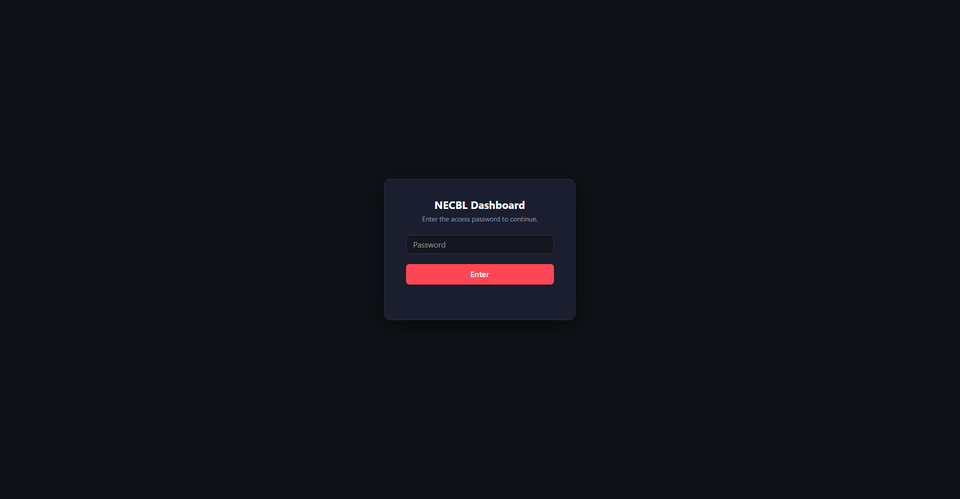
This is the gate that would appear at startup in the latter portion of our season, and is the same setup as the Navigators dashboard (next page). I added it in July for one specific reason: one of my analytics interns from the summer got an offer to play for another team in the league, who, in fact, we were fighting for a playoff spot with, so I didn't want any of this being used against us. The password is compared as a SHA-256 hash, and the interface is only rendered to the user after a correct password is entered, so nothing exists for an unauthorized user.
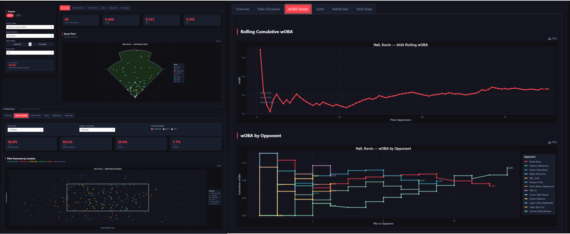
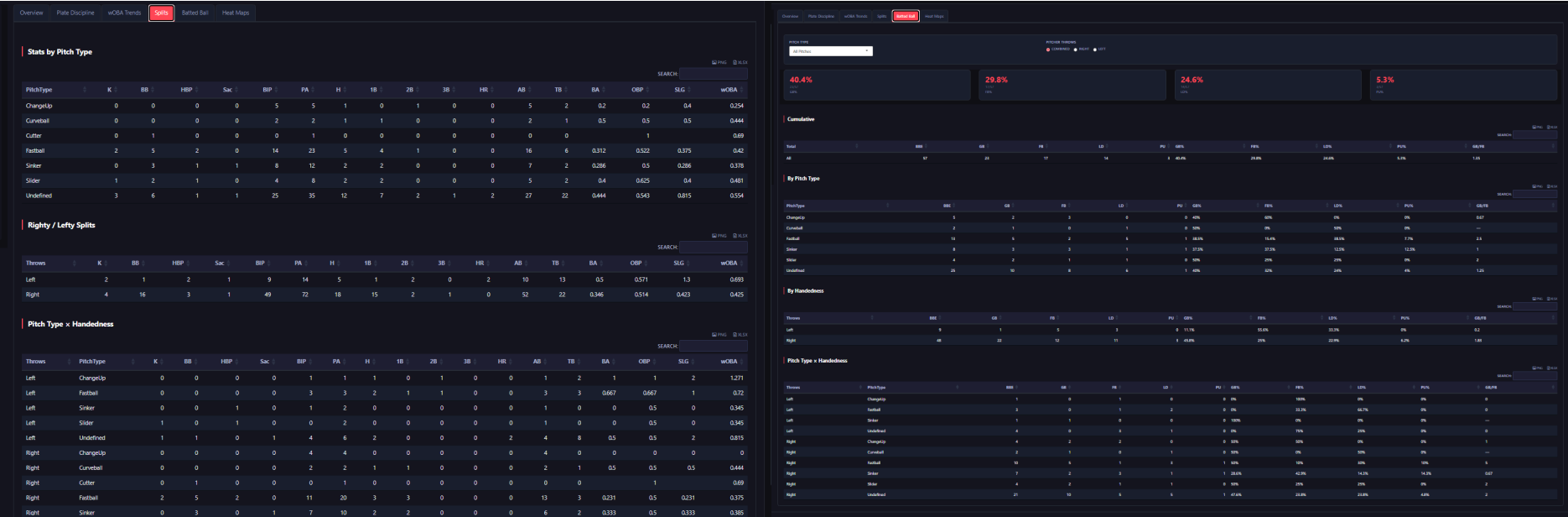
After entering the password, the user is shown the hitter side of the dashboard, which holds six tabs: Overview (spray chart and basic numbers), Plate Discipline (swing decisions and coordinates), wOBA Trends (rolling), Splits (L/R and by pitch type), Batted Ball, and Heat Maps. As this is league-wide, you pick a team first and then a batter within it. The rest of the sidebar is the season, date range, pitch type, and a little card denoting what the filter resolves to, along with a manual refresh button at the bottom with a timestamp, and a PNG/XLSX export on every chart and table, since this is the main tool I use to pull from for my reports for the coaching staff and players. For demonstration, I used Kevin Hall of the Martha's Vineyard Sharks and UAB. As you can see, he had 86 plate appearances between June 5 and July 27, with a .468 wOBA, .523 OBP, and a .565 SLG. The Overview tab gives both those numbers and a spray chart colored by the play result. Then, Plate Discipline, which plots every pitch the batter has seen against the strike zone, colored by result, along with a table at the top with their zone swing, zone contact, whiff, and chase rates. The next tab is wOBA Trends, which essentially just plots his rolling cumulative wOBA against the plate appearance number rather than the date, with reference lines for .320, .370, and .420, with another chart splitting it by opponent. The Batted Ball and Splits tabs are table-based, cut by pitch type, handedness, and the two crossed. Batted ball handles contact quality. One thing, too, worth noting in his splits, is that the largest single bucket is "Undefined," at 35 of his 86 PAs and 25 of 57 batted balls. That is the result of Martha's Vineyard not tagging any of the pitch types, and it is exactly the problem that the admin tools further down exist to fix.
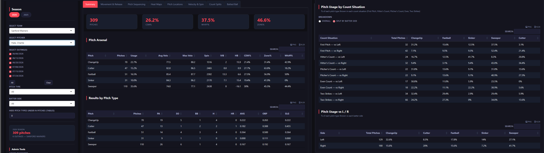
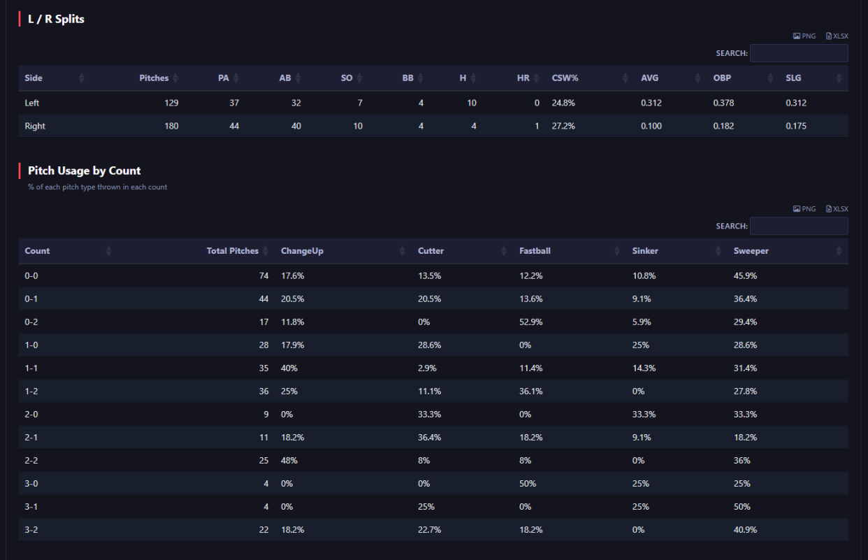
Next is the pitcher side, which has eight tabs, and the sidebar changes yet again: team, individual pitcher, then individual outing as checkboxes rather than a date range, so you can look through any selection of outings that you want. There is also a threshold for hiding pitches under N pitches in the tables, which keeps some mistags from showing up and messing up usage rates. I added that feature, as some pitches would come through with no velocity, spin, or break at all, meaning that the lasso couldn't touch them. The lasso works off both the movement plots and the velocity and spin table, and those shapeless pitches aren't on it, so they would pile up regardless in the usage tables as "Undefined" and mess with the rates, so these thresholds would cut them out and save me the frustration (I eventually added an option to wholly delete those pitches later on). To demonstrate this first page, I used Charlie Hale of the Sanford Mainers and UConn (and formerly Endicott, so I have plenty of experience working with him, and know that everything in his profile is fully accurate). He has 309 pitches over 6 outings, a 26.2% CSW%, a 37.5% whiff rate, and a 46.6% zone rate. The arsenal table shows pitch count, usage rates, average/max velocity, spin, induced vertical break, horizontal break, CSW%, zone%, and whiff% for each pitch, and the results by pitch type sit underneath alongside left/right splits. Then, after that, the part I actually use the most for advance scouting, which is the pitch usage by count, with every count bucket (0-0, hitter's count, pitcher's count, even count, 2 strikes) with a toggle for batter handedness, which I then matchup to the pitch locations tab, which has the precise locations for each of these pitches, in order to identify where and when and to which handedness he throws these pitches. Knowing that Hale, for example, goes to the sweeper 52.4% of the time first pitch to righties, heavily down and away , and to the changeup 58.8% of the time in even count against lefties, zoned more frequently, is important to know.
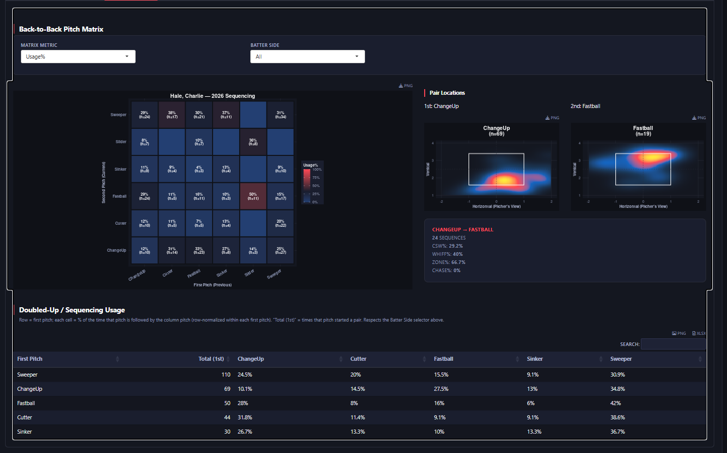
The Pitch Sequencing tab holds a back-to-back matrix with every pitch pair he has thrown, with the first pitch on one axis and the second pitch on the other. Display options are usage (which is being utilized in the image), whiff%, CSW%, zone%, or chase%, and can be filtered by batter side, with every cell displaying the sample size next to the rate. Clicking on the cell opens the pair, with locational heat maps for both pitches side by side, yet again with sample sizes and lines underneath, showing, in this case, that a changeup into fastball comes back as 24 sequences at a 40% whiff and 66.7% zone rate. Underneath the matrix is a doubled-up table showing the same information, so each row reads as what the pitch gets followed by. The pitch sequencing matrix was a tool I used to make my tunneling thesis actionable (see tab), and I have felt like it helps to display necessary sequencing information effectively.
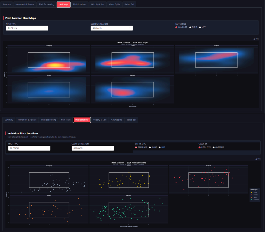
Both of these tabs (Heat Maps and Pitch Locations) filter the same way, with pitch type, count/situation, and batter handedness, and Pitch Locations also adds a toggle to color by pitch type or by outcome. Heat Maps gives the smoothed version per pitch type; Pitch Locations gives the unsmoothed version, with every pitch plotted as a dot. Those filters are what make the other half of the usage-by-count tables mentioned above. Usage overall will tell me the rate at which an arm will go to a specific offering on first pitch to righties, but, these plots, when filtered to first pitch to righties, show me precisely where he works with the offering so that our lineup has a better game plan for how he will attack them.
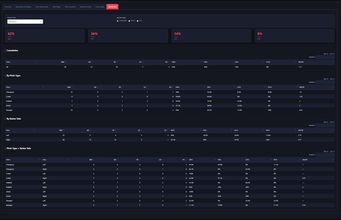
Then, the batted ball tab closes out the pitcher side, cut four ways: cumulative, by pitch type, by batter handedness, and by the two crossed (I.E., Sliders vs lefties). Hale sits at 50 batted balls here, with a 1.17 GB/FB rate, but the sweeper is an outlier at a 0.43 GB/FB, and against righties in particular its 11.1% ground ball vs 77.8% fly ball, which may be a tell to our offensive staff to look for the sweeper to righties, as it is easier to elevate. Next, I will be showing a demonstration of the admin mode on another pitcher, which I find to be the most important part of the dashboard. I am going with another pitcher as I already have corrected all of Hale's pitches, and there are still some pitchers in the dashboard that could be corrected.
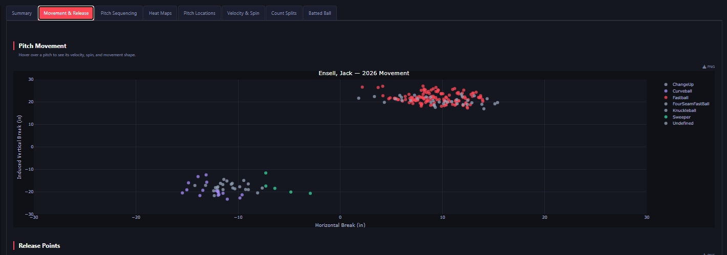
In-game pitch tagging in the NECBL is handled team-by-team, and, for the most part, is done rather poorly. Plenty of pitches are undefined (some teams don't even bother to mark them), and plenty more come through labeled incorrectly, which is worse, as an undefined pitch at least shows up visibly, while a slider sitting as a fastball could quietly move usage rates, velocity averages, and everything else. For our own arms, this is not an issue, as after every game, I check in with pitchers on their usage/grip changes, so all tagged pitches for our arms are accurate (also all existing shapes are used as references for in-game tagging). However, that is not the case for most other teams, so the correction workflow is built into the dashboard itself, sitting behind an admin password in the sidebar of the pitcher side, and in admin mode, the movement plot shows every single pitch regardless of filter, including the untagged ones. This is Jack Ensell, of the Valley Blue Sox's plot before I touched it (we were done playing them rather early in the season, prior to the development of this tool, so, that is why there are so many incorrect pitches, as otherwise I would've gone in and retagged any rostered pitcher we may face). As seen in the picture, there are two main clusters on the screen, and seven different pitch types tagged in the legend, showing just the sheer unreliability of leaguewide tagging (see breaking balls incorrectly marked as changeups, etc.). It is reasonable to assume that everything with high vertical break and armside movement are fastballs,and those have come through under several different tags (will see in video the specific tags and shape information to deduce that they are all one pitch). Everything with depth and gloveside action should show as one pitch, yet it is marked as four separate ones, as a Curveball, Sweeper, Knuckleball, and Changeup, and strangely enough, the less sweepier ones are marked as a sweeper for some reason. None of these obvious visual tells are visible in a table (except for maybe some base readings), where everything reads as a seven-pitch arsenal, when in reality it is just two different pitches that the batters have to be prepared for. The video below shows me working through the process of correcting pitches.
In the video above, you can see the process of pitch correction. First, I enter the admin password, and the screen shifts to allow me to edit pitches. As I click through tabs, you can see the table with misidentified pitches, the velocity and spin chart (which I set to high to low in order to identify undefined pitches that could differ greatly in velocity and spin but have similar break readings (I.E., A high vertical movement changeup that could mesh together with a fastball on a break chart, but when shifted to this chart, you can more quickly identify the velocity and spin differential for proper tagging)), and the main pitch movement plots, where each individual pitch, when hovered over shows the basic shape information to help with identification. As I go through, I can see that all pitches with depth and glove side are to be marked curveballs, to which I hit "Apply Changes," and move on to the high vert, armside offerings. After looking through all the shapes, I see that they are all simply fastballs, so I tag them as such and hit "Apply Changes." After that, I check through the pitch shape table, and the velocity and spin table before finalizing these changes. I then hit "Push Corrections to Github," which sends the session's accumulated log and writes it to corrections.csv (see image below) in the repo through the GitHub API, reading the file's current SHA, appending rows, and redeploys everything with the corrections with a row count and timestamp. Once that runs through, I then hit the "Update Data" workflow within GitHub, which runs quickly and actually updates the data for the next time you open the app (see image below the corrected pitch plots). The changes show in session, with every correction being changed immediately, so every downstream view reflects it before you have gone anywhere. However, to get these changes to hold, one must go through the whole loop in the video so that they are saved. The scouting reports, which I will show at the end, are built on these corrected tags, which are massive game-to-game.
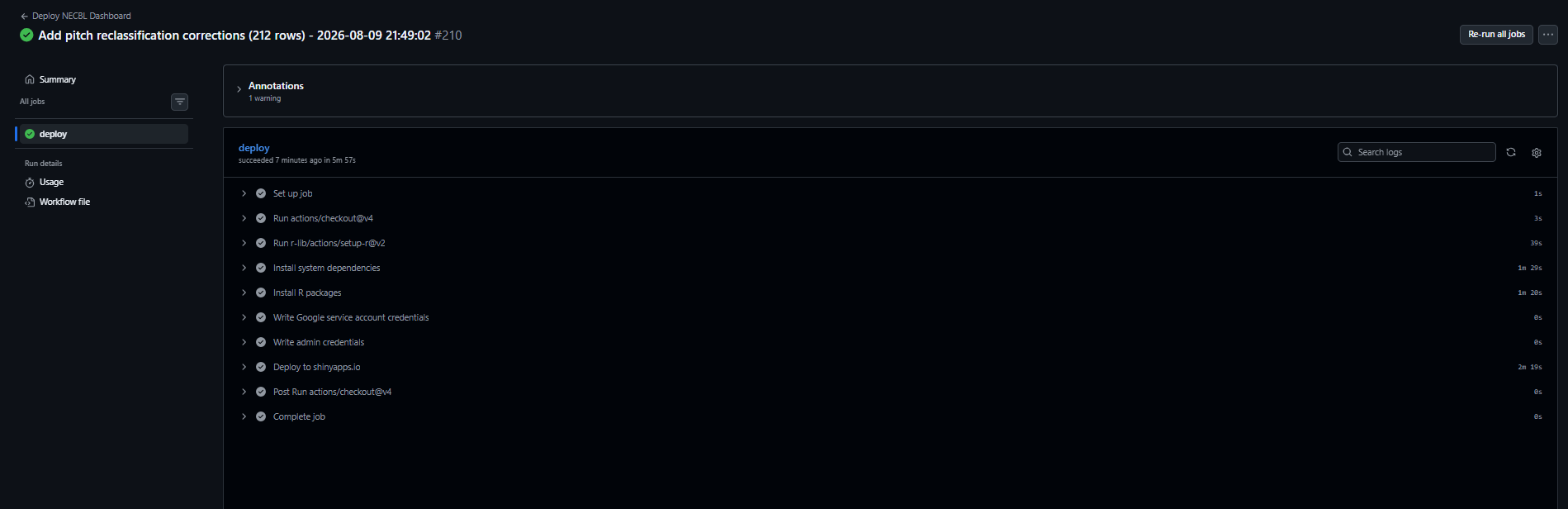
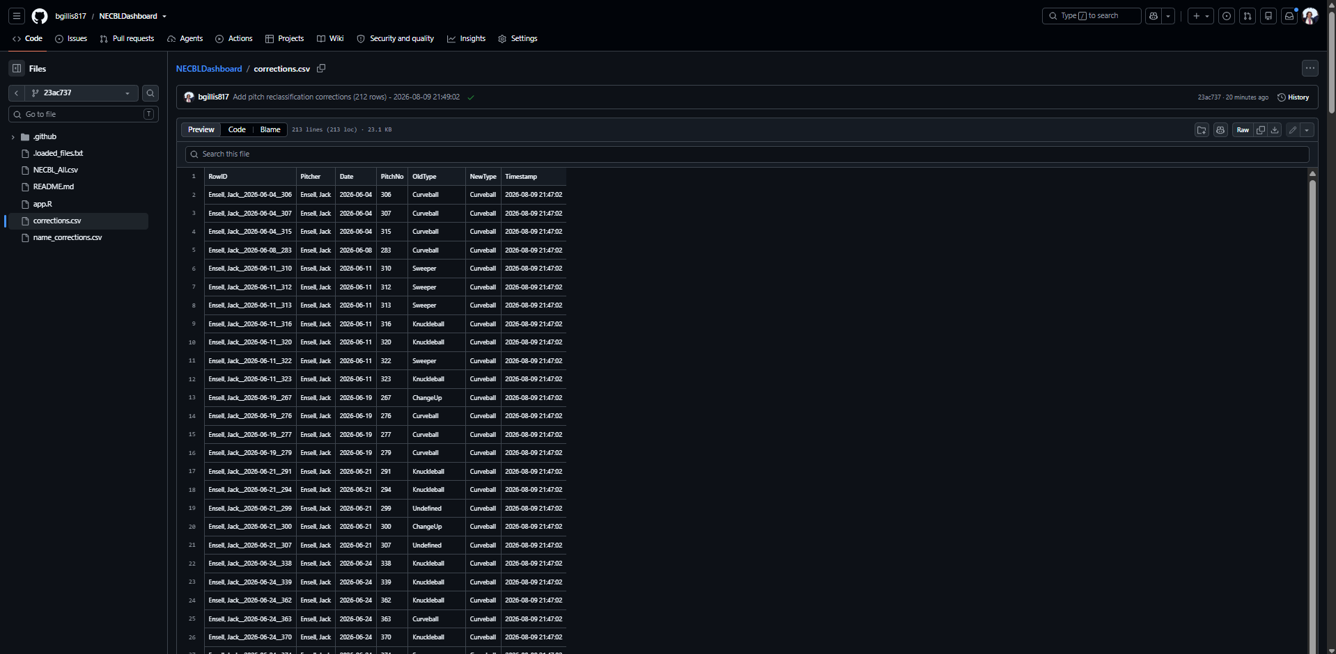
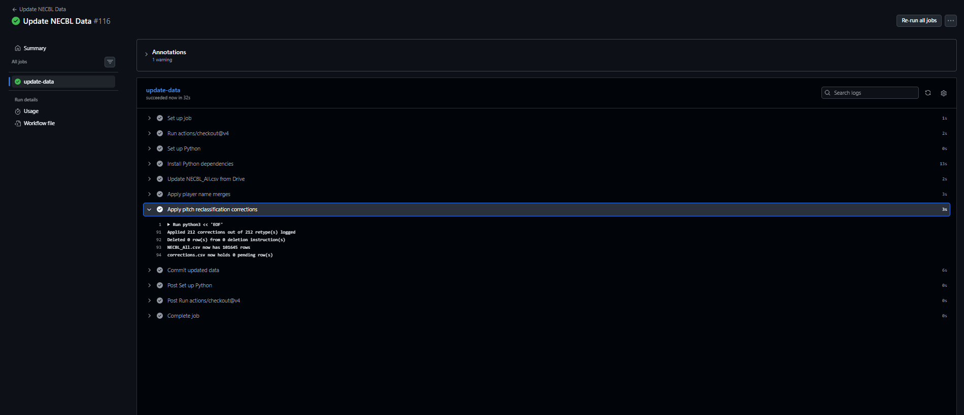
These images show what the "Push Corrections to GitHub" button does, and how to apply the changes, in order. At the top is the deploy, which fires on its own when the user hits the button in the dashboard. The commit lands in the repo, and the workflow triggers off it, which is why the run shows the commit message rather than just a "Deploy" title. In the middle is what the commit wrote: the corrections file. Corrections.csv has a row per change with RowID, pitcher, date, pitch number, the old type, the new type, and a timestamp, so everything is auditable. As you can see, the rows read with the order of changes I made in the video, with all the curveballs properly marked as such, and then, near the bottom of the CSV are the pitches shifted to fastball. The third image is the data job, which is the one that does much of the work and actually applies it, as the previous push only sends the correction to my repository. The "Update Data" workflow reads the pending rows in corrections.csv and matches them with NECBL_All.csv on a pitcher, date, and pitch number key and overwites the tag on the row in place so that nothing gets appended and a pitch doesn't appear twice. Deletions are an exception however, as only then are rows physically dropped. Before any of this, corrections on the same pitch are collapsed by timestamp so that only the most recent one survives, which means that if the user goes back and corrects a pitch twice, it will know that the most recent tag is the correct one. The file is then rewritten, and the loop is closed per the logs (shows corrections). Left alone, the initial deploy updates overnight, but it can be triggered on demand, which is what I did for the purposes of this demonstration.
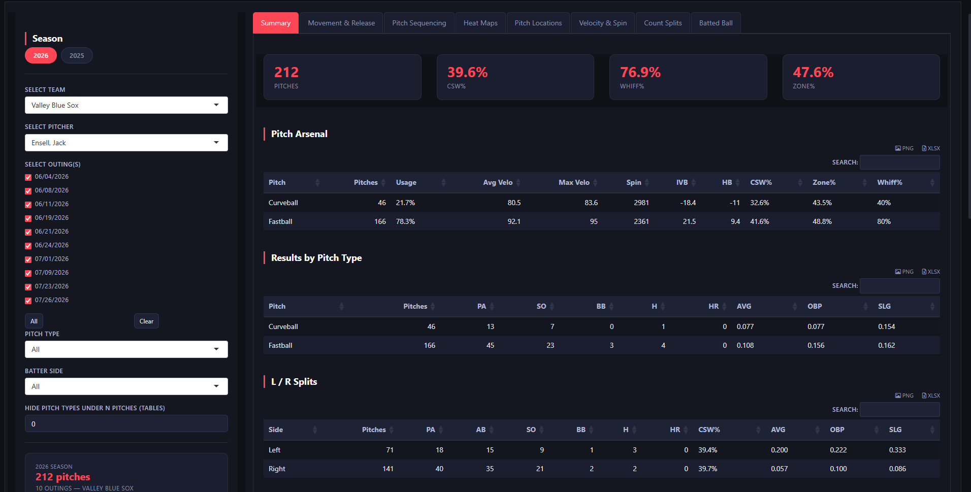
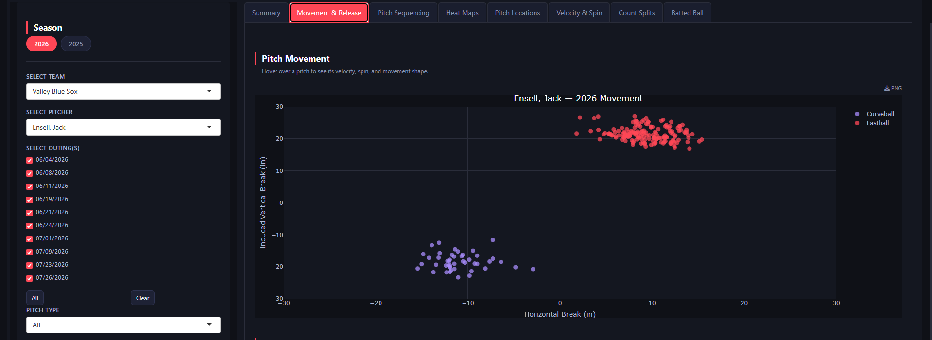
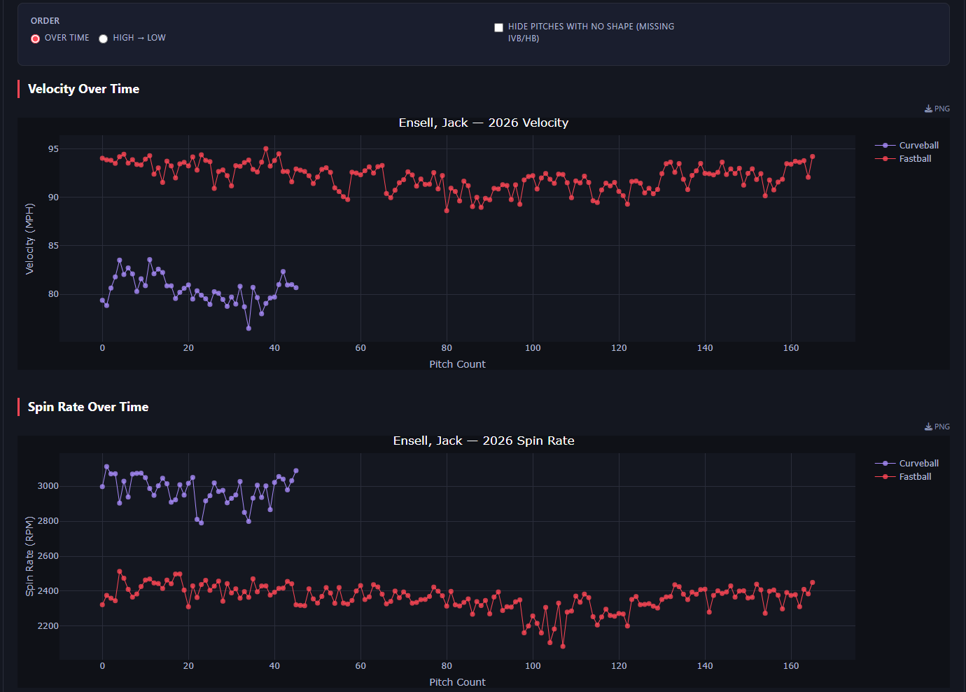
This simply shows the Arsenal Summary, Movement & Release Plots, and the Velocity and Spin Trend Table updated after the workflows ran properly.
Here you can see the scouting reports tab, which helps me to produce the material we may need on arms before any given game. I rarely use the team mode function, but it gives cumulative totals for an opponent with lefty/righty splits, breakdowns by pitch type, and by opponent. That function is generally good just to check a team's general tendencies. Next, however, is the player mode, which generates a PDF for any selection of players with checkboxes controlling which sections are included. In the video, you can see the process of creating a scouting report for all rostered Sanford Mainers' arms. Please hold in the middle of the video, as the scouting report is being generated.