
Endicott Pitching Dashboard
This tool came out of a constraint we had as a Division III program. While I would've loved to have a Trackman stadium unit, or even a portable one, to help out the team at Endicott, who year after year are competing for a national title, and this year were unfortunately walked off in the championship round by Denison (51-3) in a decisive game 3 in extra innings. Due to the nature of being D3 and having limited resources, spending $20k on a Trackman unit wasn't a real possibility (even though I did push heavily for it and have a ton of experience troubleshooting with it due to my first two years with the Navigators, where a ton of work had to be done to adequately recover our server). Instead, we had two Rapsodo units that could only be used in practice settings. We had two iPads running Rapsodo at practice, one for hitters, one for pitchers, and I was always on the pitcher side, as I could identify the pitch types. Rapsodo can't be used on the field during a game, so everything in here is bullpen and practice data, as there are no hitters, results, or live at-bat outcomes. What it does have, however, is shape, command, and release point data, measured pitch-by-pitch, which is precisely what is needed for pitch design. Getting the data was an awkward process at first, as sessions only finalized once the iPad was off the server network and onto normal Wifi, and pitch types are editable in the cloud, but said outings would only show depending on how the session was ended. Once I saw that everything was exportable by CSV, I built this dashboard to house everything, based on a previous version of my Navigators dashboard. However, to get everything working properly, I had to remove all outcome-based items from a template of the Navigators dashboard, and standardize the column names to match the right metric. Once all of those were in place, I was able to build the whole application out properly. As with the Navigators, every tagged pitch type is accurate, as they were all confirmed directly with the pitchers.
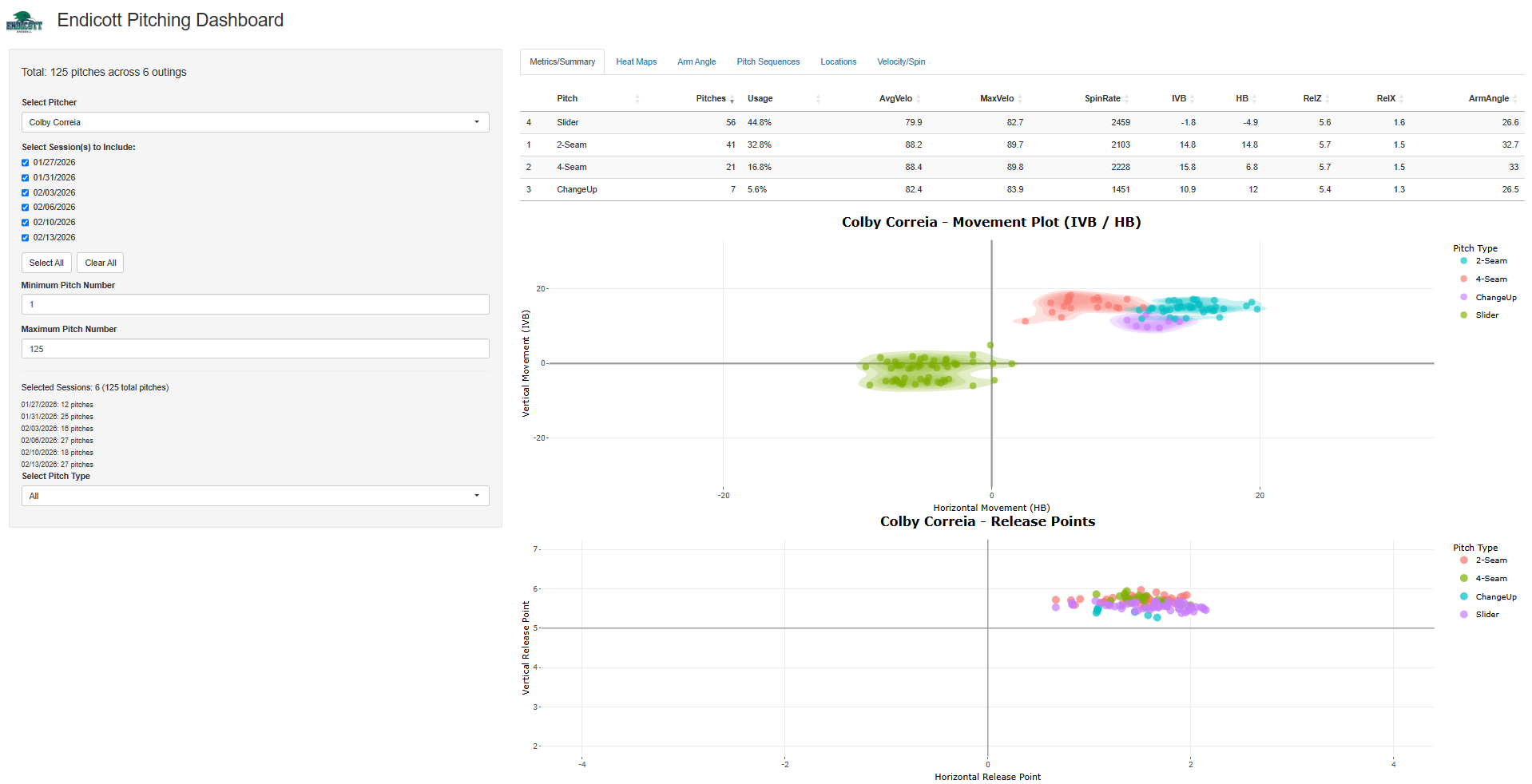
The first page here contains all pitch shape information, along with release point data as well. The sidebar here is built around specific bullpen sessions, with each as a checkbox, with the pitch count for each listed underneath, with a minimum/maximum count, so that we could look to see specific shape/velo deteriorations or gains throughout an outing. Here, I used Colby Correia (he was fine with me using this) across all six outings, 125 pitches between January 27 and February 13. The table on top, akin to my other dashboards, holds pitch count, usage, average/max velocity, spin, induced vertical break, horizontal break, release height and side, along with the calculated arm angle for each pitch release, with the movement plot underneath that draws the actual clusters with density contours around them, with release plots below it. Both plots are hoverable, as placing the cursor over any given pitch pops up the full readout. On a Rapsodo unit in the gym, these two plots show much of the picture, as there is no plate discipline/batted ball data to fall back on. The important part here was finding shape consistency, maximizing what these arms had, and finding what they did when their shapes were optimal.
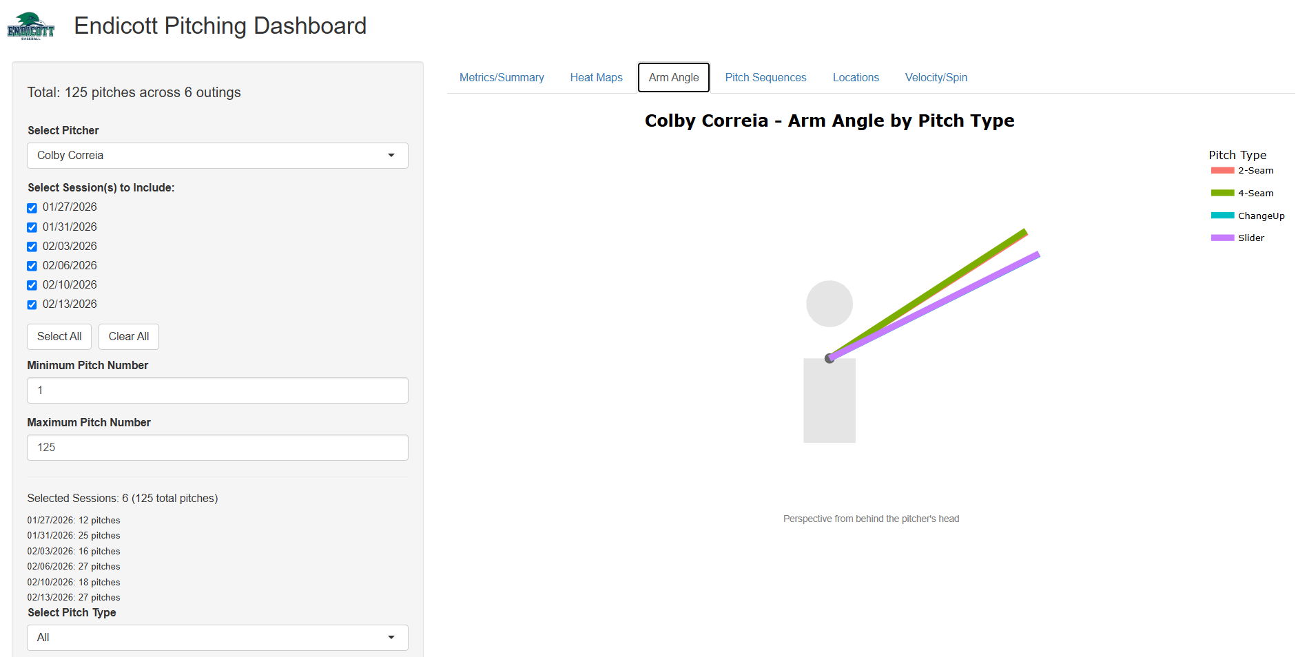

Rapsodo doesn't report anything regarding arm angle, so this tab is one that I had to derive. The unit gives release height and side, but to get an accurate angle reading, we need a shoulder to measure from, so I manually entered every pitcher's listed height and approximated the shoulder at 77.6% of it (a number that I saw was commonly cited for the average man). From there, the angle is the arctangent of the vertical difference between the release point and that shoulder height over the absolute horizontal release distance, converted from radians to degrees (see image of calculation). The plot then draws each pitch type's average arm angle from behind the pitcher's head with one line per pitch type. Correia's 4-Seamer came out at 33 degrees, with the 2-Seamer at 32.7, which is to be expected for two different fastballs, as those should be indistinguishable out of the hand. However, his slider was at 26.6 degrees and the changeup at 26.5 degrees, a six-degree difference from his fastballs. Over time, for hitters, this is an obvious tell and can work to their advantage (major component of my thesis), so this plot became immensely valuable for pitch design conversations.
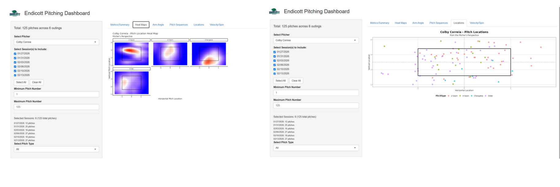
The heat maps tab gives the smoothed-over location per pitch type from the pitcher's perspective, and the locations tab gives every pitch as a dot against the zone, color-coded by pitch type. Unlike my other dashboards, there is no count or game-state information collected per pitch type, so there are no filtering options. He had 125 pitches across 4 different pitch types, and thus, the dot plot is probably the better one to use for such a sample. He only had 7 changeups in this sample, and a density surface built on these 7 pitches will look far more confident than it should. His 2-Seamer lives up, and same with the 4-Seam. His slider works down and gloveside, and the changeup works down.
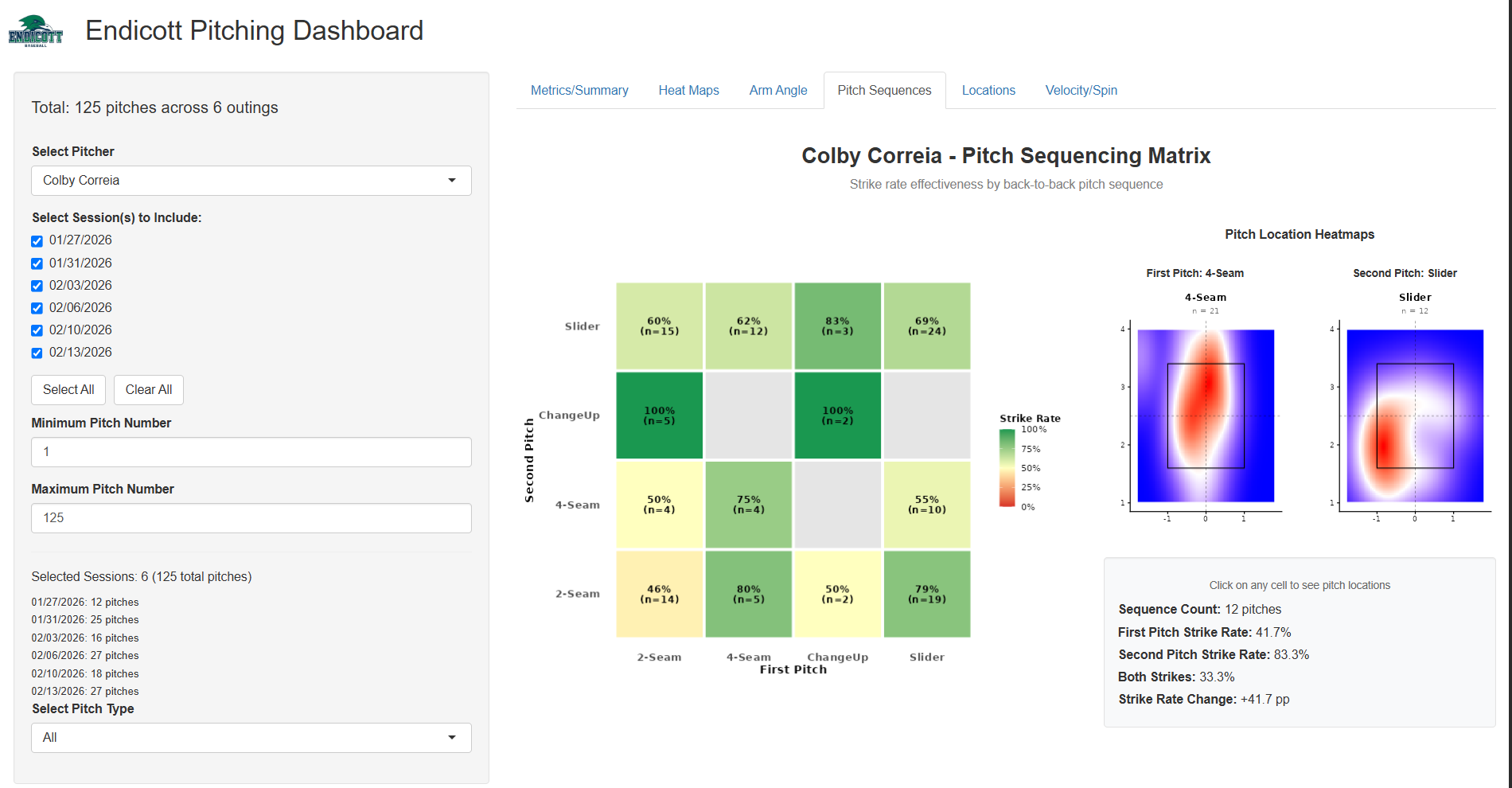
This tab exists, as one of our pitchers asked for it. I built this dashboard pretty soon after finishing my thesis on quantifying tunneling, where I had made a sequencing matrix based on expected run value for game planning purposes (akin to the Marlins strategy from the previous year), and he wanted to see how well two of his pitches played off each other consecutively, so, I adjusted the matrix for this version and all of the pitchers liked it. Obviously, there's no game-state or batter information, so there is no run value available, and because of that, the matrix runs on zone rate instead (how well he zoned his pitches back-to-back, which was a part of the question he was asking in the first place). Every consecutive pair he threw shows as a cell, with the rate and sample size within it. Clicking the cell pulls the location heat maps alongside a panel breaking out the sequence, count, the zone rate on each consecutive pitch, how often both were zoned, and the change between the two. On practice data I would not read too much into any single cell, since most of them are single-digit samples, but the ones with volume behind them are valuable.
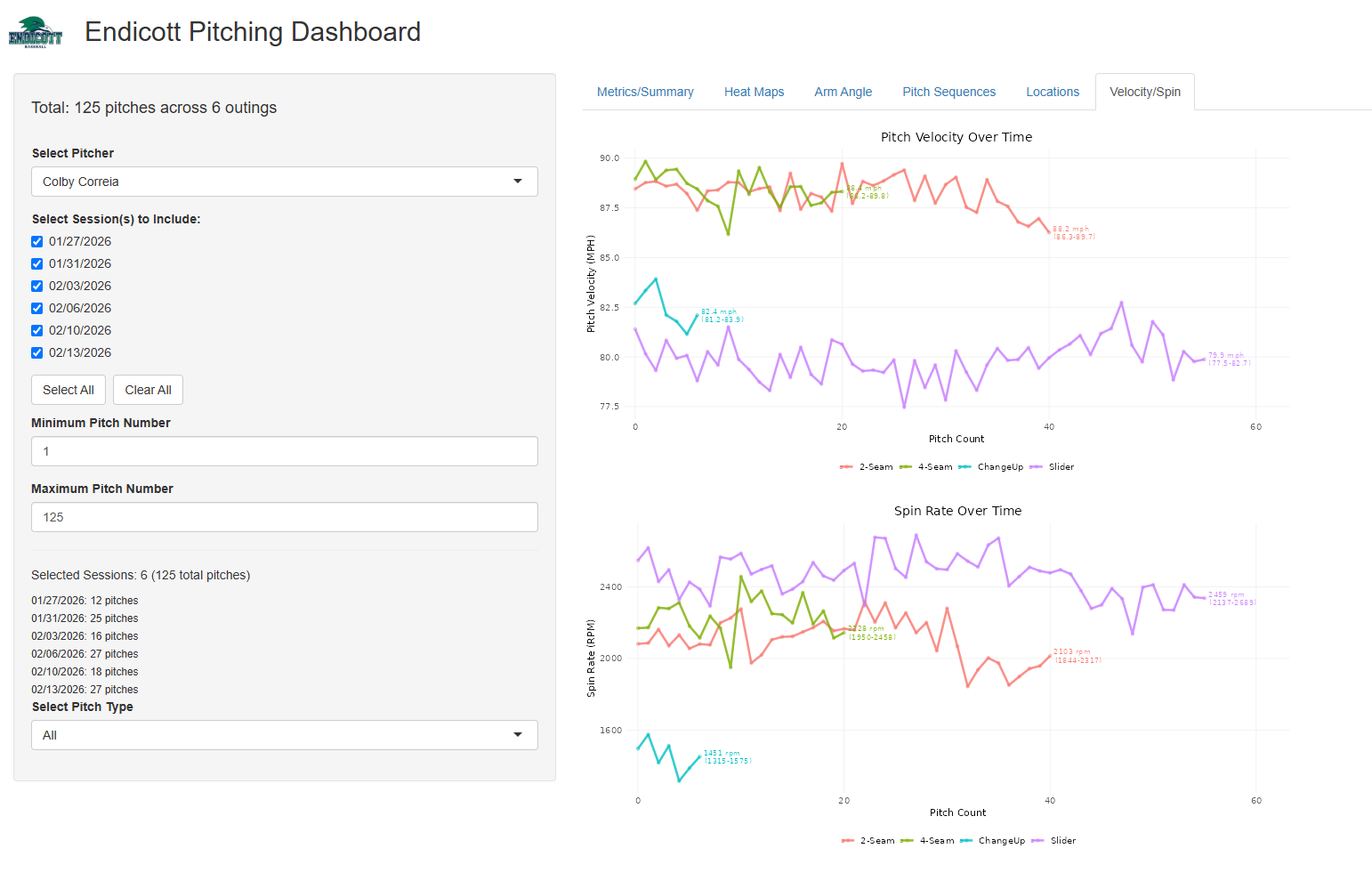
Velocity and spin are plotted against pitch count across the outings, with a line per pitch type, withthe average and range annotated on the end of each. These charts help to see whether a guy holds his velo and spin deeper into his outing (particularly useful when you click one checkbox in particular), and is also the fastest way to catch shape deterioration over any period of time.