Single Game Pitching Reports
After every game, I received CSVs from Trackman with data on every pitch thrown from each game. Rather than initially relying on the team portal, with mistagged pitches due to human error from across the league, I would go directly into the CSV, edit the pitch types based on the shape characteristics, and reconvene with the individual players to ensure accuracy of the data.
Utilizing the code below, upon cleaning up the data, I was able to produce much more accurate and accessible reports for each pitcher at the end of the game, rather than going through each pitch in the Trackman team portal and recalculating averages and highs (Velo and Spin). Instead, I would change the pitch types in the CSV, and would get my own, more accurate version of the results from the game that could then be shared with the players and on @NavigatorsData.
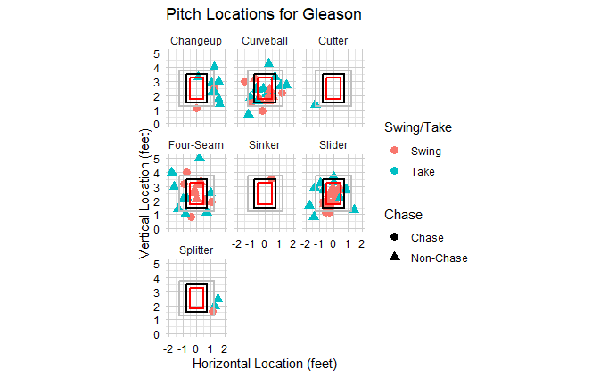
Above is a location report, along with swing decision information for each pitch type.
Utilizing ggplot, I generated strike zones with the horizontal and vertical locations for each pitch thrown during the game. When the data didn’t get uploaded to Trackman in a swift enough, or accurate enough, manner, I was able to edit the pitch types in the CSV, and generate a location plot within an hour after the game ended. Which allowed the players to communicate their results to coaches in a much more timely manner. It shows how each pitch type in an arsenal performed on a given night, and, what generated whiffs or takes from a given team.
Above is a color-coded pitch movement plot.
Utilizing ggplot, I created a break chart on an x/y axis, which, as mentioned, gave me the ability to get this information back to the players in a quicker manner than usual.

